Tuesday, 26 February 2013

Editing Pt VI

 
Today was our final day of editing and we began editing the final chorus. Originally we edited the sequence much to quick and had to re-edit each shot, as although we wanted this section to be the big finale, the original speed we edited the clips made it difficult to watch due to sudden and quick changes in costume and loaction.

The final chorus was much longer than the others in the song and so we needed to still keep variety, however without using too much of one or the other, this was something we wanted to make sure of when using split screens. We used very few with in the final chorus, however more than before. Including a split screen of the floor sequence. This was a horizontal split screen, meaning the clips ran across the frame rather than down like before (however, we then changed our mind about the edit and removed these from the final cut). We also used a four way split screen during the final chorus, they were each of the artist in different location, we had to crop the images so that all four could fit across the frame, this meant each shot was a small close up. We then had the clips enter the frame one at a time, to do this we staggered the slips on the timeline.
We also used match on action in the final chorus between two different dance sequences, one with the fire background and the second with the new kaleidascope background.

The final chorus was pretty basic in terms of editing, we did experiment with different effects such as tile, which tiled the clips in the frame, however this was too much along with quick edits. We also altered the vibrancy of some of the kaleidascope images by using the vibrancy effect and increasing the amount, this was due to the shots originally being much too pale compared to other shots in the chorus. .

We then exported our video from Final Cut Pro and then through Quicktime shared this video to Youtube. However, after watching the video on Youtube there are some issues we need to change and then re-upload the video.

I think this clip is too far away and the artist is lost in the
background, so I will scale the artist so she fills the frame
better, also some of the earlier fire shots, the colouring of
the artists skin is yellowed.
This is something I will try to fix later today.
I need to remove this clip from my Final Cut as
 it is repeatedly used and becomes repetitive. My
 final chorus consists of too many close ups,
I will experiment by adding some mid shots.
There were also issues with the white background shots.
The white background had not been scaled to fill the frame
and so occasionally you can see the edge of the frame.
I will need to go back over my clips and scale up the white
background.
During my editing I had forgotten to add a drop shadow
to these shots. This is something I need to do
otherwise the dancers look flat rather than 3D
which is what I want.
Whilst watching my Final Cut I noticed that you
 briefly see the edge of the artists arm. I will
need to scale her up to avoid this being on show
during my music video.
During my edit I didn't realise that this shot of the artists
 mouth is out of time. This will need to be fixed in
order to create a realistic and believeable music video.


Monday, 18 February 2013

Strike a Pose; Vogue

Above is an example of a possible magazine advert for our artists album. We took a lot of inspiration from JessieJ's "Who You Are" Magazine Advert. (Don't worry we'll change the text this is just a mock up). This is an example of what our magazine advert would look like if we were to use the above image as our album front cover. We were worried we would have to rule out completely this image because it was a close up so would not work in a magazine advert. However Jessie J's album also uses a close up, and substitues the bottom with a black strip which displays information. We think the advert is well suited to our genre and music video, as it uses images, costumes and locations which appear in our music video. The close up image is also very typical of pop as it makes the artist the focal point, as pop is very "me, me, me". The mode of address is also direct as the artist is looking directly at the audience, this creates a connection between the artist and audience, this is very typical in pop as it makes the artist likeable which is incredibly important in a competitive industry and genre, such as music and pop. Despite being an advert for a pop artist, the advert looks sophisticated and adult, appealing to a mature aspirant market. The magazine advert also follows typical conventions of a MagAd, such as the artists and album name and a website, there are also company logo's in the corner. The Advert also uses persuasive language to make audiences buy the CD, by bigging it up. If we did choose to use this as our final Advert, we will add a release date and change some of the text.
I tried using a Gold Font on one of my possible inlays as the
colour gold is typically associated with fame and fortune,
which will appeal to an aspirant market that aim to be like
pop artists.
Below is our second idea for our magazine advert. Our advert is very similar to Katy Perry's, as it follows closely the conventions of pop, her target audience is also similar to ours, as her extravagent videos are deliberate to make audiences want to be her. The image for our advert is very typical of pop as its flirty and sexy and the artist is still directly addressing the audience with her mode of address. The font uses typical popping colours which are bright and eye catching, and the dream like font adds an element of fantasy, again creating this extravagant world that audiences want to be a part of.  Bright candy colours such as pink and red are very typical within pop, It reflects the dream like fantasy world that pop videos create and the positive atmosphere they induce through upbeat music. Colours such as red also have connotations such as “sexy”, which are typical themes in female pop artist music videos. E.g. Rock videos tend to use dark colours because of the dark themes of their music. Dream like curly font is very typical in pop, it reflects the dream like fantasy world that pop artists create through using exotic costumes and locations, all designed to make audiences aspire to be them.


Comma, Comma, Comma, Comma, Comma, Company Logos!

During the half term break, on days I couldn't come in to college to use the mac software to edit my music video, I started to design my magazine adverts. However, I noticed that  both the magazine advert and inlays for the album artwortk contain company logo's from the producers and distritbutors of the works. Rather than to research through many different companies to find one perfectly suited to my new brand of Adele and popular music, I decided to design my own.

To the right is the design for my first company logo. As Adele is a british singer I created a UK based company, called London Records. The image came from Fotoflexer, an online editing tool which supplies editing accessories such as images. The image of the crown is very british, and the idea of royalty will appeal to our aspirant target market who aim for fame. The font is also very simple, which is typical of most company logos, they tend to use easy to read, bold and simple fontLondon Records is a new company, founded in 2010, and its parent company is EMI Records, which is a huge British Record Company. We decided to create fairly new companies, as our brand of Adele is new and fresh and didn't want her to be attatched to outdated labels as she is trying to appeal to a young and modern audience.


To the left is our second design for a company logo, called "The Red Lady Effect". It is suggested that this is a huge record company as it is associated with MTV and founded in the United States. The company again is fairly new, founded in 2000, ideal for our new artist. Compared to the first logo, this one is much more younger, this is due to it being directed at Pop Artists, the logo uses bright popping colours and an element of sexiness, through the use of red. This will appeal to a typically female orientated audience, who will aspire to be like pop aritsts. The logo is very simple, and again uses bold and easy to read font and the image suggests a genre and target audience.


This is our final company logo, called "MamaMusic". This is suggested to be our largest company due to its association with "Universal Music Group". The company is not genre specific as it produces and distributes for various artists hence the logo is our most simple, this is because it is not genre specific and hasn't been made into a brand like the other two, which have strong characteristics. The name is simple and effective, as this is a music company which would be more interested in drumming up cash rather than independent music companies which focus on the artist. This is ideal for our artist as she is an upcoming international star who has been branded in a specific way similar to other pop artists, whereas if she were a indie artist, she would want an individual style and would likely lean towards a smaller record company.

Tuesday, 29 January 2013

EDITING Pt III: Rough Cut

24/01/13 - 29/01/13
Friday - Tuesday
By Friday's lesson we had finished all our filming. I decided to start editing from scratch, this was because of the new footage we had gathered and decided it would be easier to edit from the start rather than to add the new footage and then have to fiddle around with the other clips already on the timeline. 

I began by editing the opening beat sequence, which uses multiple split screens. Despite a lot of the dance clips being un-useable, we were able to incorporate all three in to the introduction. We cropped and scaled down the clips so that they would all fit in the frame, we did this using the crop and transform tool. We then moved the clips so that each dancer would enter the frame on 
one of the beats which signaled a change of position.

We also used a second split screen in the opening sequence, however rather than three clips we used just two from the new footage we had gathered. We dragged a close up shot of someone answering the phone and a mid shot of the same phone being answered. Originally, the shots appeared on the timeline seperately, using match on action, however the shot sequence looked less like a music video. So I decided to experiment using a split screen, using the crop and transform tool and placed the close up of the phone on the left side of the frame and the mid shot on the right. I then altered the clips so that the phone would be picked up, then matched the clips so it looked as if the phone was moving from one clip into the other as the artist answered it.
Then I began to re-edit the first verse, originally the first verse before contained the dance sequence, however so this didn't become repeptitive throughout the music video (due to the choreography being very basic and repetitive) we decided to use the silhouetted dance sequences during the chorus instead. Now our first verse contains multiple shots of the silhouetted profile and shots from the bedroom sequence. We dragged these shots onto the timeline so we had a variety of shot types to work with, including a mid shot, close up, profile and extreme close up. I then edited the sequence so that the shots would cut across eachother, using match on action. We used quicker cuts as the song lead up to the first chorus, at 0:36 where the song is silent, in order to build tension

We were also able to edit the opening of the chorus from "Bless your soul ....She ain't got your love anymore". This is where we introduced a third location and costume, the green screen. This section used multiple cross cuts between shots from the bedroom sequence, the silhouetted profile and close ups and mid shots of the green screen, using match on action between shots. For our green screen we used the same technique as before, mentioned in our Editing Pt II post, using a keyer and then applying multiple layers to give a 3D effect.
As the section ends, we used a four way split screen of the artist singing "Rumour Has It", this added variety to our shots but also established our music video style and genre, as split screens are very typical within Pop. To create the four way split screen we used the same technique as before, we layered the clips on top of eachother on the timeline and using the transform and crop tool, we were able to scale the images down and place them in each corner of the frame.
Below is our rough cut. Currently its only 1 minute long due to our decision to start again. There were also issues with the syncing once the video was exported and uploaded to Youtube which effected some of the feedback we received.


Tuesday, 22 January 2013

EDITING pt II

 
15/01/2013-18/01/2013
Tuesday
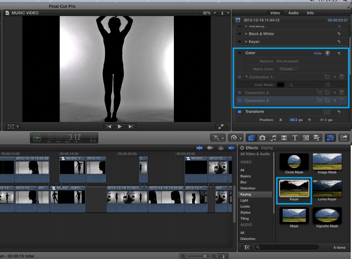
Today, due to the lack of footage we currently have, we experimented with a variety of effects. Because the keyer we attempted to use last week wasn't very effective we attempted a new strategy. We fiddled around with the exposure and contrast of the clips so that the white background became brighter and the black silhouette much darker. Using this effect solved the issue of the two thick strips either side of the image. We attempted to re apply the 'keyer' however, this was no better than our first attempt. Although the image looked a lot cleaner and clear, the original had character and a professional look. We decided to ditch the effects and keep our original shots.
 
The two images above is our experiment with the  colour correction
tool before and then after. Below is when we applied the Keyer
to the second image. As you can see it did not have the desired effect.
We also began editing the chorus today. Originally we had planned to use a moving gif image as our background, however when we keyed out the green screen and added the background, it looked too animated and robotic. We quickly solved the issue by dragging a second similar background onto the timeline below the gif, this filled the frame and made the image look more dense and the gif flow better. We also downloaded a gold glittering effect using a Youtube converter. We then dragged this over to our timeline and placed it above the shots using the green screen. We then altered the composition of the effect, by clicking the drop down menu and selecting "overlay". This made the green screen shots look a lot more 3D and less 2 dimensional.

The images above illustrate how we applied the keyer to our
original image and the layered multiple backgrounds to create
the finished effect. The first three images are our layers. The fourth
 image illustrates how we adjusted the composition of the glittering
effect and how the finished image looked.

 
Today we also solved the "keyer and multiple dancer issues". Instead we used a split screen effect, using three panels which come into the song at separate points. We used a similar effect in our Little Mix Edit, in the first four beats of the songs, each individual singer enters the frame at a different point. The split screen effect will be useful as it adds variety to our opening dance sequence.
The red box in the left hand corner shows that our three
different clips enter the frame at three different times. Shown
by how they have been stacked on the timeline.
During the chorus of the song we also attempted match on action, between the dancer against the white backdrop and the artist against the green screen. We also used match on action, by enlarging unique actions, so the camera almost does a close-up and we cut across to this. An example of this is when the dancer dips down, bending her legs outwards, halfway through the action we cut across to a close up. Although we didn't originally film the action in close up, we were able to manipulate this in the edit.