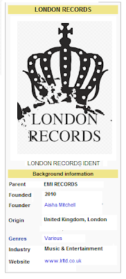
To the right is the design for my first company logo. As Adele is a british singer I created a UK based company, called London Records. The image came from Fotoflexer, an online editing tool which supplies editing accessories such as images. The image of the crown is very british, and the idea of royalty will appeal to our aspirant target market who aim for fame. The font is also very simple, which is typical of most company logos, they tend to use easy to read, bold and simple font. London Records is a new company, founded in 2010, and its parent company is EMI Records, which is a huge British Record Company. We decided to create fairly new companies, as our brand of Adele is new and fresh and didn't want her to be attatched to outdated labels as she is trying to appeal to a young and modern audience.

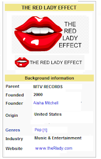
To the left is our second design for a company logo, called "The Red Lady Effect". It is suggested that this is a huge record company as it is associated with MTV and founded in the United States. The company again is fairly new, founded in 2000, ideal for our new artist. Compared to the first logo, this one is much more younger, this is due to it being directed at Pop Artists, the logo uses bright popping colours and an element of sexiness, through the use of red. This will appeal to a typically female orientated audience, who will aspire to be like pop aritsts. The logo is very simple, and again uses bold and easy to read font and the image suggests a genre and target audience.

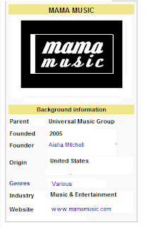
This is our final company logo, called "MamaMusic". This is suggested to be our largest company due to its association with "Universal Music Group". The company is not genre specific as it produces and distributes for various artists hence the logo is our most simple, this is because it is not genre specific and hasn't been made into a brand like the other two, which have strong characteristics. The name is simple and effective, as this is a music company which would be more interested in drumming up cash rather than independent music companies which focus on the artist. This is ideal for our artist as she is an upcoming international star who has been branded in a specific way similar to other pop artists, whereas if she were a indie artist, she would want an individual style and would likely lean towards a smaller record company.
No comments:
Post a Comment