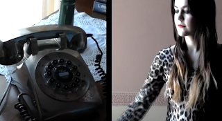
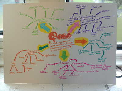
Goodwin says within music video there must be a link between lyrics and visuals which would either illustrate, amplify or contradict the music. An example of this convention in my music video is the use of the "Phone Shots". The song is about rumours spreading and we thought the use of a phone was a key way in which rumours and idle gossip were spread and so illustrated the idea of rumours. However, our music video also challenged the form as it is largely performance based, so there is no narrative and minimal links between lyrics and visuals, however we were still able to create an effective and professional looking music video.

Goodwin also says there should be a link between music and visuals. I believe we successfully used this convention within our music video, as our quick cuts keep to the pace of the music throughout, with cuts changing as the the beat and lyrics change. The pace of the music video also slows down during the bridge section, are use of fewer cuts illustrates this change in pace.
Another feature of Goodwin's theory which is relevant is that there will likely be references to voyeurism, particularly in the treatment of females. An example of this within modern music videos is Katy Perry's "I Kissed a Girl" where there is a succession of close up shots of intimate and sexualised images within the first few beats of the track, and Katy Perry is viewed as a sexualised object.
Carol Vernallis was another media theorist that we included when analysing our music video and how it used, developed and challenged the forms and conventions. Below is a video which explains her theory and then compares it to our media product.
I have also used intertextual references from two of Lady Gaga's music videos, the first being the use of the Kaleidoscope background used in Lady Gaga's video "Paparazzi" (which is also an intertextual reference to Alfred Hitchcock's 'Vertigo') I have also references to Lady Gag's "Telephone" music video with the use of costume, for example the red telephone in the artists hair. Postmodernism and Intertextual references are typical conventions of pop videos as audiences are able to identify with references and recognize them across different medias.
Another theory/concept that can be applied to our music video is Carlsson's theory which says that music video's fall in to two different categories. Performance and Conceptual, Performance Clips tend to show mainly just the artist or artist singing and dancing whereas Conceptual Clips show something else during its duration often with artistic ambitions. Our music video is mainly performance, as it contains mainly filmed performance of the artist in different locations whilst lip syncing. The performer is often made into a materialization of the commercial exhibitionist, this is where the performer is made almost into a selling item, fans typically will aspire to be the artists as the video will be high in quality and often glossy. This is present within our own music video as we tried to create a professional looking finish, also as our chosen target audience are members of the aspirant market, they therefore aim to be like and idolize artists. In order to make audiences aspire to be like our artist we had strong themes of voyeurism, where our artist is made into a sexual object through costumes however she comes across as sexy and confident, which is a quality most women seek.
There are also typical conventions of Digipaks which my media product has used. We kept to the relevent conventions for a Pop release while also challenging some of the conventions. Some examples of effective digipaks from Pop Artists are Katy Perry's own digipaks for "Teenage Dream" and "One of the Boys".
Some typical conventions of pop album covers is the use of popping bright and glossy colours, this is evident in Katy Perry's digipak as she uses bright candy colours, such as pinks and reds, as their connotations (sexy, flirty and feminine) appeal to the female market that pop is typically targeting. Within Pop digipaks there are also typical aspects of voyeurism through the use of close-ups, this makes the album more intimate and the direct mode of adress means audiences can identify with the artist. There are also elements of mise-en-scene, costume which contain elements of voyeurism. It is also important that digipaks are consistent, that similar colours are used throughout and typically images from the music video are used for example Katy Perry lying in the pink clouds, not only does this contain elements of voyeurism but also is taken from her music video for "Teenage Dream". The digipak also needs to be conistent across all media platforms, for example, typically the album cover is also used as the magazine advert so that audiences can easily recognize the album. Another typical convention of Digipaks is the use of font, within pop this tends to be dream like as it suggests to the audience that the pop artist lives within this dream like fantasy world which makes their audiences want to be like them and be part of this world.
Jessie J's album cover is also used for her magazine
advert. Keeping consistency across her digipak on
all media platforms.
My digipak has both used these conventions and then challenged them.
MY FRONT COVER:
My albums front cover has used a close up of the artist who is directly addressing the audience, this is so that audiences feel they can relate and identify with the artist. It is also so that the album can be easily marketted as audiences are aware of who the artist is straight away. There are also aspects of voyeurism within my front album cover. My artists expression suggests something flirty and sexy, however this is very subtle. Aspects of voyeurism are typically used to make audiences want to be like the artist. However, my front cover also challenges the typical conventions outlined above regarding album covers. Rather than using a dream like font, mine is very simple and sophisticated, the simplicity of the font means audiences are not distracted from the artist, making her the central focus of the album cover, which is very typical within pop. The simple font is also sophisticated, which will appeal to my aspirant market which will typically be older, 17-25, whereas Katy Perry tends to appeal to the younger teenage market, hence why she uses a playful font, rather than the simple, sophisticated font I used.
MY BACK AND INSIDE COVERS:
MAGAZINE:
While researching for my magazine advert I realized magazines are often based upon their digipak, typically using the front cover image. However I decided to challenge this convention by using a different image for my magazine advert however was still based on my digipak. I therefore used an image that I also used as one of my inside inlays, where the artist is stood in the bedroom, wearing the leopard print leotard and holding the phone. This meant there was still consintency within my digipak. Katy Perry did a similar thing with her "One of the Boys Digipak" where she used a different image for her magazine however, location and costume were the same as her album cover.
In our digipak we continued to use typical conventions of pop, such as the voyeuristic images. We also applied typical conventions of magazine adverts overall, such as record labels and release dates, we even included a website address where are audience could find out more about the album, this is a very useful tool as our audience is young and part of the digital age so are more likely to go online and visit the website.


No comments:
Post a Comment