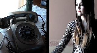
The above video illustrates some of the key features of Final Cut Pro that we used when making our final video, including green screens, split screens and others.
A vry sad storii. Leo holdz da gld oskar to his ch33k. Da crowd go silint in anticitatipaction. He liftz da objekt above his hed. He criiez "I've dne it, ive finilly dne it" Den Leo wok up frm his drem. Lyk dis if u crii everytym.
Friday, 22 March 2013
Thursday, 21 March 2013
Evaluation Question 3: What have you learnt from your audience feedback?
WHO?
When gathering feedback for both our rough cut and final cut music video, as well as for our ancillary texts including the magazine advert and the digipak we had to keep in mind who our target audience were. If we were to collect feedback from an inappropriate audience it is unlikely they would relate to the video and feedback would generally be negative or even oppositional (Stuart Haul - Reception Theory), whereas If we target our video appropriately to the right target market, it is more likely they would identify with both the video and the artist and would react more positively to the video. When reseraching into potential and different target markets we looked into Michael Maffesoli's theory of Urban Tribes. (Video Below) and the UKtribes online website. http://uktribes.com/?p=about&id=null
 Urban tribes are divided into 5 different groups, each with their own individual subgroups. Aspirant Mainstream, Mainstream, Urban, Alternative and Leading Edge.
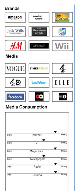
 From our reserach we concluded that our own target market would belong to the Aspirant Mainstream Market, and would typically be either Trendies and/or Rahs. This is due to Trendies and Rah's typically living privlidged lifestyles and have a wide range of fashion tastes making the market very appealing to girls. The aspirant market are also major consumers and can easily be marketted through magazines, internet and billboards, making them the ideal target market for a major pop video, as they are highly influenced by celebrities and media and would likely find the privlidged lifestyle of the pop artist and the glossy professional video appealing.
The aspirant mainstream market are also very media savvy, with heavy internet consumption, using websites such as facebook and amazon frequently. They are also more likely to have a disposable income as they are able to shop at high street chains such as Topshop and Jack Wills, meaning they would be able to invest in our album. Because our market heavily consumes both internet and magazines they would be easily marketable and because our video will appeal to 17-20 year olds, using magazines such as Vogue and internet websites such as Facebook to advertise will be more appropriate.
USER & GRATIFICATION
When creating my music video I took into consideration, Dennis McQuails "User and Gratification" Theory. (Video Below)
The theory states why we use and consume media, and in relation to Music Videos the two most important reasons to consider are "Personal Identity" and "Entertainment". When creating my music video I had to make sure that it was entertaining and kept audiences hooked but also reinforced their own "Personal Identity" meaning my audiences need to identify with the video and the artist through either behavior, music and fashion. If my music video addresses both Personal Identity and is entertaining audiences will react positively to my music video, and my feedback and video would be successful. If my video didn't reinforce their personal values and address their identity they wouldn't be able to relate to the video and wouldn't find the video entertaining, possibly producing negative feedback.
FEEDBACK: HOW?
Once I had completed my music video I used online sources in order to gather feedback, including Facebook (as my audience are heavy internet consumers) Youtube, such as statistic which illustrates my audiences consumption and even using questionnaires and class feedback in order to gather feedback directly from my Primary Target Audience.From Youtube statistics I discovered how people were viewing mi video. Nearly 50% of viewers had used a mobile device, such as an iPad or mobile in order to view my video. This would suggest that my video is targeting the correct market, as younger people, up to the ages of 30 tend to use mobile devices more often in order to consume online media, such as Youtube Videos.
Likes and Views from Yotube which were accumulated quite quickly (within a few days of it being uploaded) suggested that the video was successful and people enjoyed watching it. There were also positive comments from Youtube as well. This allowed us to make changes to our production in order to appeal more to our target audience, but also showed that our video was successful in targeting our audience correctly.
From our Rough Cut to Final Cut you can see that the amount of Facebook likes we received improved. This suggests that overall people preferred our Final Cut to our Rough Cut, which is usually what you'd expect to see as your final cut tends to be the perfect version. The comments we received on Facebook were also all really positive. Suggesting audiences had Preferred our video rather than Opposed it, suggesting we successfully target our audience and that our video was overall entertaining and appealing.
ROUGH CUT to FINAL CUT
We gathered feedback throughout our research and planning and also during the construction of our music video, be exporting a rough cut, so we could obtain feedback and improve our video in order to create a professional and appealing final cut. Some of the changes we made included removing the dance sequences on the floor, improving the lip sync, making the fire sequences more aesthetically appealing, using drop shadows on the white backdrop to make the green screen look more effective and shortening the song to avoid too much repetition due to our music video being a performance based piece.
However there was some feedback we chose to ignore, due to the overall look we wanted to achieve. Students within the AS class didn't like the use of the Fire Backdrop, however we decided to keep it as it's a key aspect of the video. It carries connotations such as sexy and flirtatious but also suggests a strong female performer that would appeal to our target audience. Someone on Facebook also suggested altering the colouring within the phone sequences, however we kept the colour as it was as we wanted these shots to have a slightly different look to the rest of the video, as they added an element of narrative but also reference Beyonce's song "Why Don't you Love" which had a similar style and colouring.
FEEDBACK
In order to gain Feedback for my final cut I directly asked my audience what they thought. I asked people who were part of my primary target market, The Aspirant Market, people who were not necessarily part of the Aspirant market however were still in the same age group and also asked people who were part of my Secondary Market, which are typically people who are older than my target audience but are still likely going to listen to the song. (Video Below)
My audience feedback shows that my music video successfully targeted my audience as all respondents reacted positively to my music video. In terms of Stuart Hauls "Reception Theory" this would suggest my audience had a preferred reading and enjoyed the video, this also suggests that what I encoded into the video was successfully decoded by my audience, as they could relate to the artist and understood references.
DIGIPAK & MAGAZINE ADVERT
Throughout my construction I also had to obtain feedback on my ancillary texts, including my Digipak and Magazine advert. This was so I could decide on a final image that would appeal to my audience but would also sell my artist.
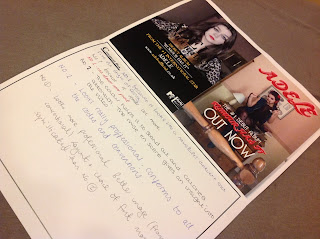
Originally I created multiple album covers and magazine adverts and asked my target audience to vote on each one and say why they preferred that specific image. I then used this research to create a final Digipak and Magazine advert which was coherent with my music video but also successfully targeted my audience.
I also attempted to use a website called "Tricider" where you can upload images and add PROS and CONS, people can go online and then vote for which they preferred, however this wasn't very successful as people couldn't understand how to use the website and I couldn't get the desired feedback.
Some of the comments on my prototypes were really positive and helped me in my decision to chose a final image. Overall audiences that preferred the first album cover (Katy Perry Inspired) said:
"I like the first one because it looks very serious yet fun"
"The colour stands out and lets the audience have an insight in what to expect"
"What you'd expect to see on a real album"
Audiences that preferred the second album cover (Long shot) said:
"It's serious and gets across the message of the song"
"I like the second because it reminds me of Beyonce"
"I like the layout of number two and creates solid brand identity"
Audiences that preferred the first magazine advert said:
"It looks like an advert and fits the style of the song"
"Its serious and suits Adeles style, number two is too young"
"Because it stands out more"
"Looks more professional, better framing, layout and font more sophisticated"
And audiences that preferred number two said:
"The colour stands out and is eye catching. Good mise-en-scene"
"Looks professional. conforms to codes and conventions"
From this research when deciding on an album cover and magazine advert image I learnt that all my images appealed to a sophisticated audiences and that my images, font and layout looked professional, realistic and conformed to conventions, which is what I wanted to achieve in my final product.
Research was incredibly important when creating my ancillary texts as it influenced many of the decisions I made concerning font and images, and overall the final product was very succesful as audiences had had a direct role so I knew the final product appealed to them. Some of the comments I received included:
"I love the album cover, it's a strong image and is eye catching and appeals to a female orientated audience as the image is appealing" - Clare Slattery
"I really like that the magazine doesn't use the same image, it's still recognizable as the same artist but adds variety" - Grainne Branaghan
"The final album cover is a lot more mature and sophisticated than the other ones I saw and is more likely going to appeal to me and my friends who are all 17-18" - Josie Dean
"The final album and magazine adverts look like proper ones you'd see in shops. It looks professional and well put together" - Arianne Beardshaw.
My feedback suggests that my Digipak and Magazine advert were successful as audiences reacted positively to each and they both had the desired effect, to attract a mature and sophisticated audience whilst creating a professional and glossy finished product.
Overall, from my feedback I learnt I successfully achieved what I had set out to do. To create a professional looking final product that appealed to my target market. It was evident that I achieved this through my feedback as the majority of audiences reacted positively to my finished product, with a few exceptions.
Monday, 11 March 2013
Evaluation Question 2: How effective is the combination between your final product and ancillary texts?
Due to the size of font, watch in full screen for the best results.
Thursday, 7 March 2013
Evaluation Question 1: In what ways does your media product, use, develop or challenge the forms and conventions of real media texts?
Goodwin says within music video there must be a link between lyrics and visuals which would either illustrate, amplify or contradict the music. An example of this convention in my music video is the use of the "Phone Shots". The song is about rumours spreading and we thought the use of a phone was a key way in which rumours and idle gossip were spread and so illustrated the idea of rumours. However, our music video also challenged the form as it is largely performance based, so there is no narrative and minimal links between lyrics and visuals, however we were still able to create an effective and professional looking music video.

Goodwin also says there should be a link between music and visuals. I believe we successfully used this convention within our music video, as our quick cuts keep to the pace of the music throughout, with cuts changing as the the beat and lyrics change. The pace of the music video also slows down during the bridge section, are use of fewer cuts illustrates this change in pace.
Another feature of Goodwin's theory which is relevant is that there will likely be references to voyeurism, particularly in the treatment of females. An example of this within modern music videos is Katy Perry's "I Kissed a Girl" where there is a succession of close up shots of intimate and sexualised images within the first few beats of the track, and Katy Perry is viewed as a sexualised object.
Carol Vernallis was another media theorist that we included when analysing our music video and how it used, developed and challenged the forms and conventions. Below is a video which explains her theory and then compares it to our media product.
I have also used intertextual references from two of Lady Gaga's music videos, the first being the use of the Kaleidoscope background used in Lady Gaga's video "Paparazzi" (which is also an intertextual reference to Alfred Hitchcock's 'Vertigo') I have also references to Lady Gag's "Telephone" music video with the use of costume, for example the red telephone in the artists hair. Postmodernism and Intertextual references are typical conventions of pop videos as audiences are able to identify with references and recognize them across different medias.
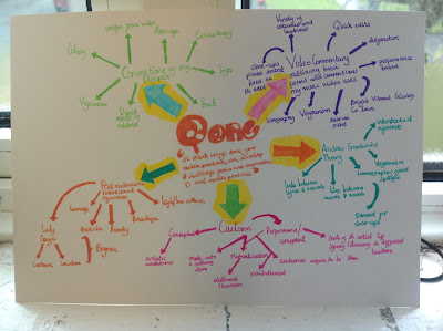
Another theory/concept that can be applied to our music video is Carlsson's theory which says that music video's fall in to two different categories. Performance and Conceptual, Performance Clips tend to show mainly just the artist or artist singing and dancing whereas Conceptual Clips show something else during its duration often with artistic ambitions. Our music video is mainly performance, as it contains mainly filmed performance of the artist in different locations whilst lip syncing. The performer is often made into a materialization of the commercial exhibitionist, this is where the performer is made almost into a selling item, fans typically will aspire to be the artists as the video will be high in quality and often glossy. This is present within our own music video as we tried to create a professional looking finish, also as our chosen target audience are members of the aspirant market, they therefore aim to be like and idolize artists. In order to make audiences aspire to be like our artist we had strong themes of voyeurism, where our artist is made into a sexual object through costumes however she comes across as sexy and confident, which is a quality most women seek.
There are also typical conventions of Digipaks which my media product has used. We kept to the relevent conventions for a Pop release while also challenging some of the conventions. Some examples of effective digipaks from Pop Artists are Katy Perry's own digipaks for "Teenage Dream" and "One of the Boys".
Some typical conventions of pop album covers is the use of popping bright and glossy colours, this is evident in Katy Perry's digipak as she uses bright candy colours, such as pinks and reds, as their connotations (sexy, flirty and feminine) appeal to the female market that pop is typically targeting. Within Pop digipaks there are also typical aspects of voyeurism through the use of close-ups, this makes the album more intimate and the direct mode of adress means audiences can identify with the artist. There are also elements of mise-en-scene, costume which contain elements of voyeurism. It is also important that digipaks are consistent, that similar colours are used throughout and typically images from the music video are used for example Katy Perry lying in the pink clouds, not only does this contain elements of voyeurism but also is taken from her music video for "Teenage Dream". The digipak also needs to be conistent across all media platforms, for example, typically the album cover is also used as the magazine advert so that audiences can easily recognize the album. Another typical convention of Digipaks is the use of font, within pop this tends to be dream like as it suggests to the audience that the pop artist lives within this dream like fantasy world which makes their audiences want to be like them and be part of this world.
Jessie J's album cover is also used for her magazine
advert. Keeping consistency across her digipak on
all media platforms.
My digipak has both used these conventions and then challenged them.
MY FRONT COVER:
My albums front cover has used a close up of the artist who is directly addressing the audience, this is so that audiences feel they can relate and identify with the artist. It is also so that the album can be easily marketted as audiences are aware of who the artist is straight away. There are also aspects of voyeurism within my front album cover. My artists expression suggests something flirty and sexy, however this is very subtle. Aspects of voyeurism are typically used to make audiences want to be like the artist. However, my front cover also challenges the typical conventions outlined above regarding album covers. Rather than using a dream like font, mine is very simple and sophisticated, the simplicity of the font means audiences are not distracted from the artist, making her the central focus of the album cover, which is very typical within pop. The simple font is also sophisticated, which will appeal to my aspirant market which will typically be older, 17-25, whereas Katy Perry tends to appeal to the younger teenage market, hence why she uses a playful font, rather than the simple, sophisticated font I used.
MY BACK AND INSIDE COVERS:
MAGAZINE:
While researching for my magazine advert I realized magazines are often based upon their digipak, typically using the front cover image. However I decided to challenge this convention by using a different image for my magazine advert however was still based on my digipak. I therefore used an image that I also used as one of my inside inlays, where the artist is stood in the bedroom, wearing the leopard print leotard and holding the phone. This meant there was still consintency within my digipak. Katy Perry did a similar thing with her "One of the Boys Digipak" where she used a different image for her magazine however, location and costume were the same as her album cover.
In our digipak we continued to use typical conventions of pop, such as the voyeuristic images. We also applied typical conventions of magazine adverts overall, such as record labels and release dates, we even included a website address where are audience could find out more about the album, this is a very useful tool as our audience is young and part of the digital age so are more likely to go online and visit the website.
Wednesday, 6 March 2013
Final Construction: Digipak
Subscribe to:
Comments (Atom)


.jpg)


.jpeg)


